


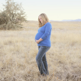

Below are more ideas for a background if you don't like the pink dots (blurry or not). The cream based ones would prob have a pink middle, while the others will keep the cream middle.
Seriously, I thrive on constructive criticism, so let me know exactly what you think. Reply to this and I'll get to it ASAP.


Here is a general idea I have for you! You can comment on anything you do or do not like. Is there enough embellishment? Do you prefer a brighter orange and pink? Tell me everything and anything. Also, the title page would be in focus more. This was just a really rough version. Or if you like the blur and want the background to be blurrier, thats fine too.
I will be by after 7 to offer more options for the background, my work computer is not loading them very quickly.
Seriously, I thrive on constructive criticism, so let me know exactly what you think.
Reply to this and I'll get to it ASAP.
I will be by after 7 to offer more options for the background, my work computer is not loading them very quickly.
Seriously, I thrive on constructive criticism, so let me know exactly what you think.
Reply to this and I'll get to it ASAP.


1 comment:
I do like bright pink and orange. I really like the pink polka dots that you've used and the brighter orange would be cute if you worked it in somehow. However, I'm leaving it all up to you.
Post a Comment